Project Overview
hey girlie.
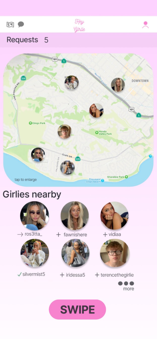
hey girlie is a mobile app designed to connect social media-savvy users for the purpose of creating content together. whether someone is traveling alone or needs help taking photos for Instagram, the app provides a platform where users can find others who share their interests in photography and social media. The target audience includes young women and content creators who prioritize aesthetics and creativity in their social media presence.
Duration
june-september 2024
Problem
Hey Girlie aims to solve the problem of users struggling to find others who can take social media-worthy photos, especially when solo traveling, away from friends. The app also addresses the issue of relying on non-expert help, creating a platform where users can connect with like-minded individuals for content creation.
Goal
The goal for Hey Girlie is to create a safe space for girlies to connect and collaborate on social media content creation. By providing a platform where users can find reliable and skilled photo partners, the app ensures they can capture high-quality photos without relying on friends or family.
My role
My role was to design an intuitive user experience, focusing on clear navigation and data visualization to make Vero’s insights accessible and meaningful.
Responsibilities
My responsibilities throughout the project included conducting user research, creating wireframes and prototypes, leading usability testing, refining the user interface, and implementing feedback to ensure the app provided a seamless user experience.
Understanding the User
Mood Board
Research: Pain Points
1
Users expressed frustration with relying on friends or family, who may not understand the specific needs of capturing social media-worthy content. Hey Girlie addresses this by allowing users to connect with others who share their goals and are skilled at taking high-quality photos, removing the pressure of depending on non-expert help.
2
User research highlighted that it can be hard to find someone readily available to take photos at the moment users need them, especially while traveling or in new locations. Hey Girlie solves this by offering an easy way to connect with nearby users who are available for spontaneous meetups to create social media content.
3
i sent surveys to friends in the target audience to verify user needs. The responses confirmed that users want a simple way to find reliable, like-minded photo partners, validating the app’s direction.
User journey maps
While creating this journey, I embodied Emily’s perspective and thought about what she would do naturally. I designed the flow to make it easy for her to open the app, find a fellow user, and set up a meetup for taking photos. The goal was to ensure she could smoothly navigate the app and feel comfortable while focusing on her content creation needs.
User personas
For Hey Girlie, I created Emily Johnson to represent the average user and their goals. Identifying her needs was straightforward, as I related closely to her experiences as a teenager. This persona helped me focus on creating an app that meets the unique social and connection needs of young, social media-savvy users, making it easy to find like-minded friends and capture moments confidently.
Starting the design
Sitemap
Paper wireframes
For this project, I had a clear vision from the beginning of how I wanted the user flow and features to function. The sketches reflect the final design closely because I typically know what I’m aiming for with these kinds of projects. This layout ensured all key functions were accounted for, from swiping to messaging, while still allowing for flexibility and user feedback later on.
Digital wireframes
Hey Girlie was my very first UX project, and it reflects my initial, unfiltered approach to design. Driven by aesthetics, I was excited to dive into experimenting with the color palette I envisioned and explore new ideas. These early digital wireframes showcase my raw UX skills and the playful vision I had from the start. To create a unique Hey Girlie universe, I even incorporated Tinkerbell characters—building a whimsical, welcoming vibe that I imagined early on in the process.
Mid - fidelity
Moving into the mid-fidelity prototypes, I started to see Hey Girlie take shape in a way that balanced aesthetics with usability. This stage was all about refining the layout, adding structure, and making sure the design felt cohesive while still capturing the playful spirit of the Hey Girlie universe. It was my first step toward translating the initial vision into a more polished, functional experience.
Usability Study
Parameters
Participants
The usability study included 5 participants, all of whom fit the target demographic for the Hey Girlie app. They were chosen to provide feedback on the app’s core features and usability.
Objectives
The goal was to assess ease of navigation, feature clarity, and overall user experience, ensuring that the app met user expectations for signing up, matching, and proposing meetups.
Tasks
Participants were guided through several key actions: signing up, accessing the home screen, using Swipe Mode to match with another user, sending a message, and proposing a meetup. They recorded their screens and provided voice memos, offering real-time feedback throughout the process.
Findings
1
Participants found the font size in the messaging feature too small to read comfortably. I increased it to improve readability and make the messages easier to access.
2
Some users found the layout of the “Swipe” feature a bit confusing, so I redesigned the interface to be cleaner and more intuitive, making it easier to navigate and enjoy.
3
Participants appreciated the ability to propose meetups directly in the chat, but feedback indicated that the process felt a bit confusing. i streamlined the date, time, and location selection screens to be much smoother and easier to navigate.
Refining the design
Mockups
Before Usability

After Usability

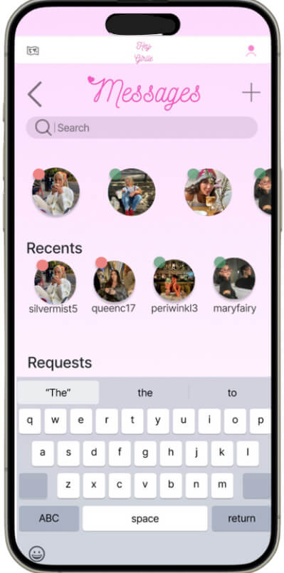
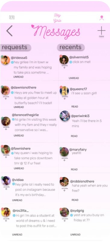
For the requests section, I made the user flow more intuitive by reorganizing the layout and adding clearer labels. This change helps users quickly distinguish between new requests and recent messages, creating a smoother interaction.
Final mockups
AccessIbility considerations
1
I increased the font size throughout the app to ensure that all users, including those with visual impairments, could easily read and navigate the content without straining their eyes.
2
the color palette was selected with high contrast in mind to make buttons and important elements stand out, helping users with low vision or color blindness interact with the app more effectively.
3
i designed the app with clear, intuitive navigation by minimizing unnecessary steps and using larger buttons, ensuring users with motor impairments can easily interact with the app.
Going Forward
Impact
The Hey Girlie project marked an important step in my UX journey, allowing me to apply foundational skills and learn through real user feedback. Developing this app taught me valuable lessons in balancing aesthetics with usability, responding to user needs, and refining features to improve the overall experience. This project set a strong foundation for my future work, emphasizing the importance of adaptability and user-centered design from start to finish.
going forward
This project taught me so much about myself and my design process. Starting out, I had no experience with Figma or even where to begin, but diving into Hey Girlie gave me the confidence to learn and grow. Having this idea during a challenging period—recovering from surgery and feeling lost—made it all the more meaningful. Learning UX design became an unexpected gift, helping me find purpose, regain my footing, and believe in my abilities. This experience was a reminder that even in difficult times, there’s room to create and move forward.
Next steps
1
The next step is to bring Hey Girlie to life by coding the app or collaborating with a developer to ensure it functions as intended for users. This phase will focus on translating the design into an interactive, seamless experience.
2
I plan to conduct another round of usability testing to refine the user experience further. This will help address any remaining pain points and ensure that the app meets user needs with ease and clarity.
3
To grow the user base, I would develop a targeted marketing strategy, including influencer partnerships and social media ads in cities with a high concentration of the target audience. This approach will build awareness and drive engagement with the app among ideal users.


