Project Overview
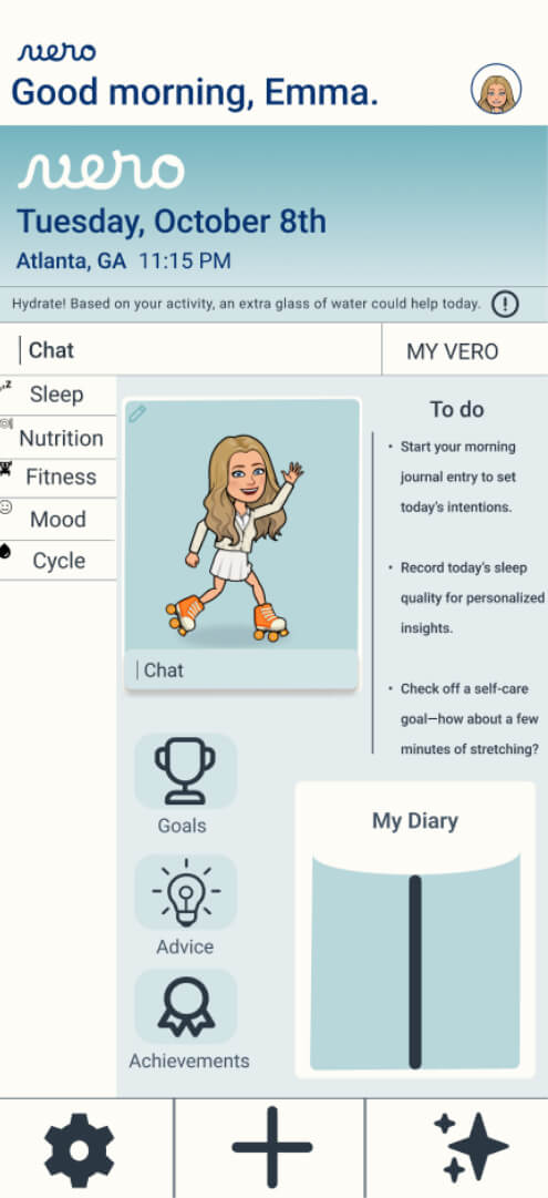
Vero.
Vero isn’t just another tracker—it’s a game-changing AI-powered hub that seamlessly integrates all aspects of your health in one place. Instead of trusting multiple apps with your personal data, Vero ensures your privacy while delivering the most accurate and personalized insights by analyzing your fitness, mood, nutrition, and cycle together. With Vero, you finally get a complete picture of your well-being, powered by AI that truly understands you.
Duration
august-october 2024
Problem
Wellness apps often clutter your phone without providing meaningful insights into your overall health. Users are left juggling multiple apps but still lack a clear, comprehensive view of their well-being.
Goal
Vero’s goal is to enable users to track key daily habits—sleep, nutrition, fitness, mood, and cycle—all in one place. By analyzing data across these areas, Vero’s AI provides valuable insights and uncovers connections in a user’s routine that might otherwise go unnoticed.
My role
My role was to design an intuitive user experience, focusing on clear navigation and data visualization to make Vero’s insights accessible and meaningful.
Responsibilities
I conducted user research to understand needs and pain points, then created wireframes and prototypes to shape the initial design concepts. I led usability testing to identify areas for improvement, refining the user interface based on feedback. Each change was implemented with a focus on delivering a seamless user experience.
Understanding the User
Mood Board
Research: Pain Points
1
Users feel frustrated by the need to switch between multiple apps to manage different aspects of their health and well-being. The lack of a single, unified platform leads to confusion and inconsistency in tracking habits.
2
Many wellness apps provide generic insights, which leave users feeling that their unique needs and routines aren’t truly addressed. Users want actionable feedback tailored to their specific health and lifestyle goals.
3
Current tracking apps often have cluttered interfaces, making it difficult for users to quickly access relevant information. Users are looking for a streamlined experience where they can easily view their progress and make adjustments without unnecessary steps.
User journey maps
While designing Vero, I created five different user journey maps to understand the five distinct functions it offers. These maps proved invaluable as I began designing the app, allowing me to base my work on one of the user templates.
User personas
While designing Vero, I developed two distinct user personas to represent key demographics. These personas helped me understand different user needs and behaviors, allowing me to tailor the app’s features to address specific challenges—such as simplifying health tracking for busy professionals and providing clear, actionable insights for wellness-focused individuals.
Starting the design
Sitemap
Paper wireframes
I really enjoy creating paper wireframes because they bring my ideas to life in a way that feels real and engaging. Using GoodNotes allows me to explore my creativity freely and experiment with different designs without any limitations- there’s nothing quite like goodnotes and my apple pencil.
Digital wireframes
For Vero’s wireframes, my goal was to create a clean, straightforward layout that made tracking daily habits intuitive. I focused on keeping the design minimal and easy to navigate, so users could quickly find what they needed.
Mid - fidelity
I developed mid-fidelity prototypes for Vero to experiment with various screen layouts and user flows, as well as to explore different colors and functionalities. The main user flow was designed to seamlessly guide users in tracking their habits with minimal friction, from logging daily activities to accessing personalized insights.
Usability Study
Parameters
Participants
5 users, ages 25-45, who regularly use wellness and tracking apps.
Objectives
Evaluate ease of navigation, clarity of information, and effectiveness of habit-tracking features.
Tasks
Users were asked to log symptoms, track fitness goals, and view comparison data across different days.
Findings
1
Users feel frustrated by the need to switch between multiple apps to manage different aspects of their health and well-being. The lack of a single, unified platform leads to confusion and inconsistency in tracking habits.
2
Many wellness apps provide generic insights, which leave users feeling that their unique needs and routines aren’t truly addressed. Users want actionable feedback tailored to their specific health and lifestyle goals.
3
Current tracking apps often have cluttered interfaces, making it difficult for users to quickly access relevant information. Users are looking for a streamlined experience where they can easily view their progress and make adjustments without unnecessary steps.
Refining the design
Mockups
Before Usability

After Usability

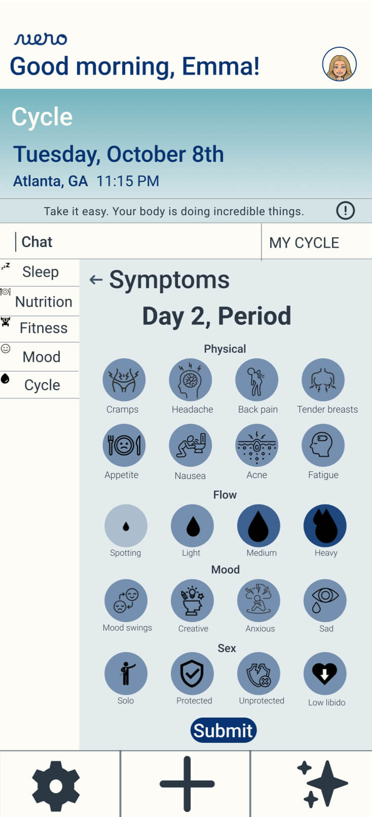
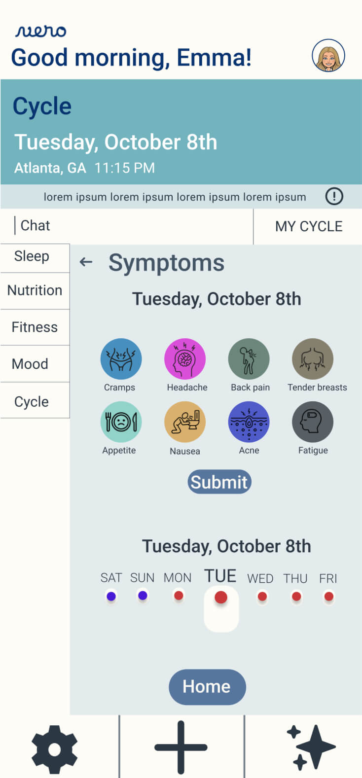
Users found the “Cycle” section cluttered and challenging to navigate, as the symptoms were scattered and hard to interpret. In response, I redesigned the layout to include more symptoms in a cleaner, more organized format. This streamlined design makes it easier for users to track their symptoms and enhances overall usability.
Final mockups
AccessIbility considerations
1
A gentle nutrition mode is designed with accessibility in mind, specifically for users who may be struggling with eating disorders or mental illness. This interface features no numerical values, ensuring a focus on well-being rather than numbers. Instead, it offers uplifting messages that promote a positive relationship with food and self-care, creating a safe and supportive environment for all users.
2
In the onboarding process for nutrition, I made it a priority to include a diverse array of dietary groups. This approach ensures that all users feel represented and receive insights and assistance that cater to their specific dietary restrictions and preferences. By acknowledging various lifestyles and needs, we can create a more inclusive experience that empowers everyone to make informed choices about their nutrition.
3
The voice memo-enabled diary serves as a valuable tool for various groups, ranging from individuals with mobility impairments to busy professionals and students. It allows for easy recording of thoughts, lectures, and reflections, facilitating communication and personal expression without the limitations of traditional writing methods.
Going Forward
Impact
Vero is just the start of what I hope to accomplish with AI. I believe that for AI to be truly effective, users need to feel secure sharing sensitive information. Vero serves as a stepping stone in that direction. If we can eventually create AI avatars that reflect our unique habits and thought patterns, we open up incredible possibilities in healthcare, education, entertainment, and beyond.
going forward
I learned that designing AI products isn’t all that different from designing “non-AI” products- simplicity and attention to detail remain the most valuable tools in creating a great experience.
Next steps
1
i’m excited to keep iterating on Vero, building connections with experts who can help bring this app to life. Turning this vision into a real product is my next big goal, and I’m ready to collaborate with others who share that drive.
2
I’m eager to keep expanding Vero’s capabilities by designing new, relevant topics for tracking or refining existing ones to be more precise. With each iteration, user feedback will guide the features we enhance, ensuring that Vero continues to provide meaningful, personalized insights for every individual.
3
To push Vero’s development forward, I plan to network with AI specialists, healthcare professionals, and user experience experts who can bring fresh perspectives and technical expertise. Collaborating with leaders in these fields will help refine Vero’s AI capabilities and elevate its value, ultimately transforming it into a truly essential app for personal wellness.


