02 / brand identity + custom website
Fern App
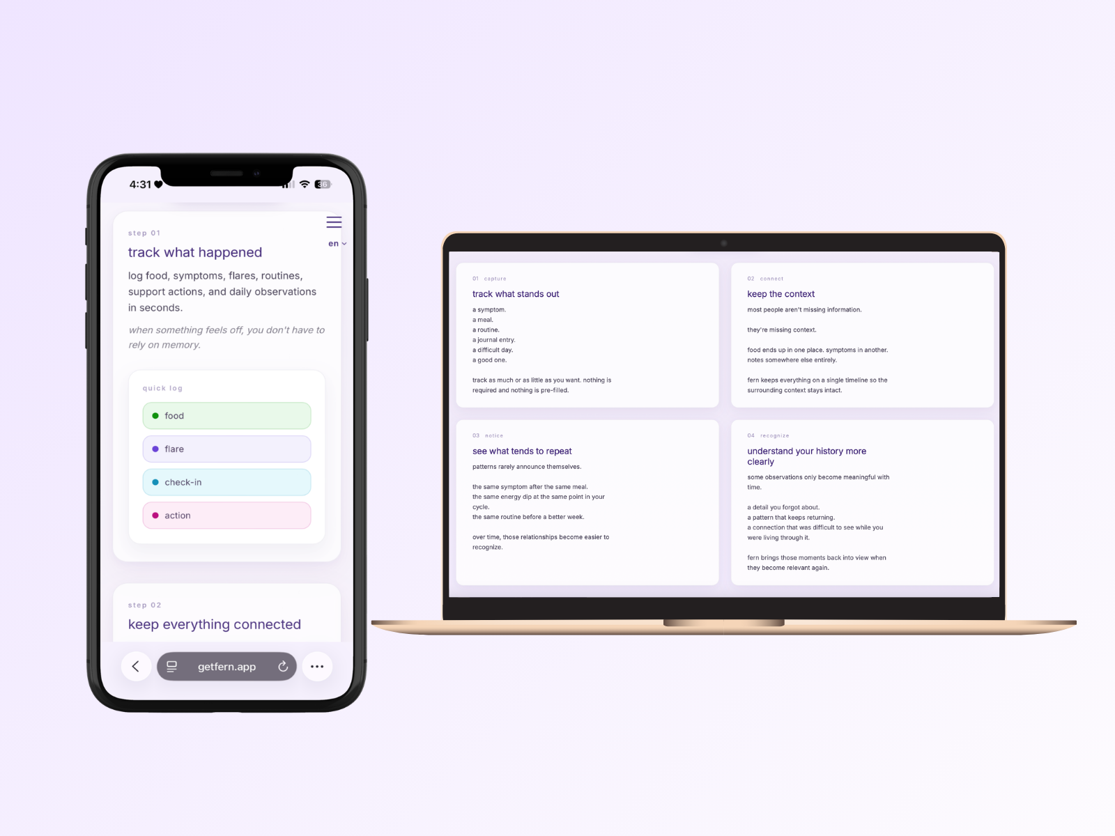
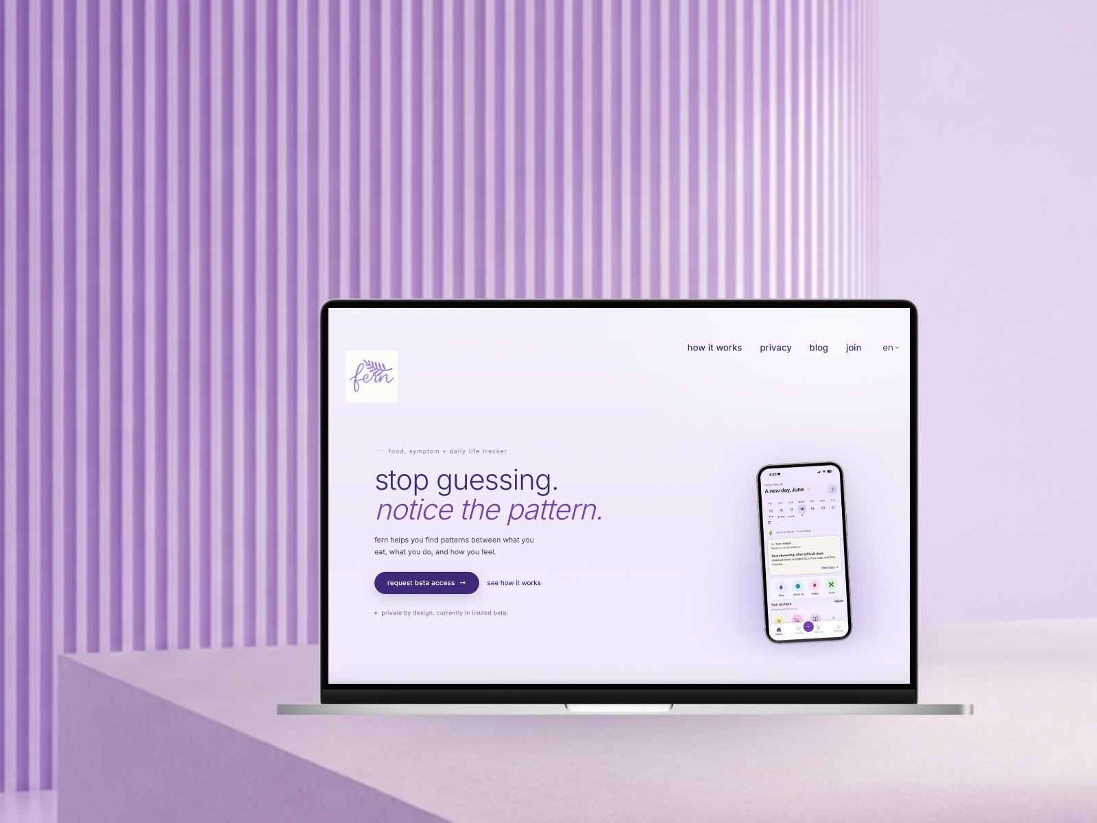
https://getfern.app/Brand identity and custom website for Fern, a wellness app designed to help people notice patterns across symptoms, routines, food, energy, and everyday life.
Fern is a wellness app designed to help people notice patterns across symptoms, routines, food, energy, and everyday life.
The website was created to introduce the product clearly, support beta onboarding, and establish the visual foundation for a broader product experience without relying on clinical language, productivity culture, or exaggerated wellness claims.
Context
Many health and symptom-tracking products focus on optimization, performance metrics, or medical framing.
Fern approached the problem differently.
The goal was to create an experience that felt reflective rather than corrective. Users were not being asked to fix themselves, improve their output, or constantly monitor their health. They were being invited to notice patterns, build awareness, and better understand what was happening in their lives.
The challenge was translating that philosophy into a website.
The product already had a strong visual direction before development began, but the website needed to communicate those ideas quickly while remaining approachable to people discovering Fern for the first time.
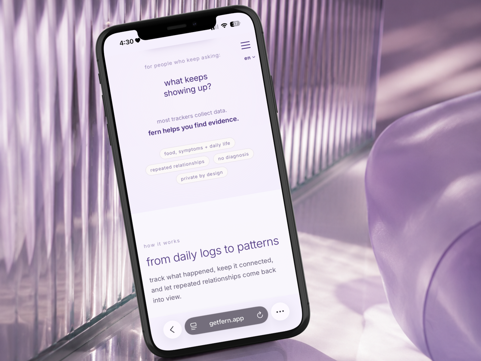
Because most early visitors were expected to come from mobile devices, the experience also needed to work seamlessly across phones, tablets, and desktop screens without losing the softness and pacing that defined the product.
Process
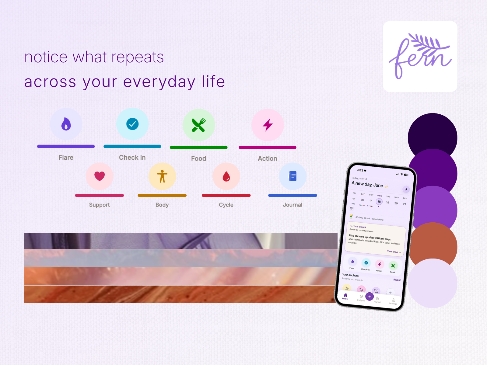
The project began in Figma with the development of a complete visual system that could extend beyond a single marketing site.
This included:
- typography
- spacing
- color hierarchy
- navigation systems
- onboarding flows
- reusable UI components
- beta signup experiences
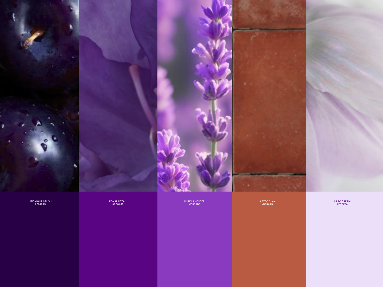
The visual direction was built around soft lavender tones, layered imagery, subtle motion, and low-contrast environments inspired by the feeling of reflection rather than productivity.
Every design decision was filtered through a simple question: How do you create a wellness product that feels calm without feeling vague?
The website structure was intentionally straightforward. Visitors could understand what Fern was, explore the product philosophy, and request beta access without navigating multiple pages or complex onboarding flows.
The frontend was developed from scratch using:
- TypeScript
- JavaScript
- HTML
- CSS
Several custom interactions were introduced throughout the experience, including dynamic hero messaging, ambient cursor effects, and layered visual treatments that reinforced the product’s quieter, more reflective personality.
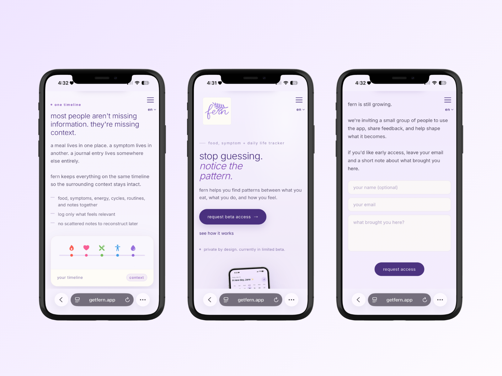
Desktop and mobile experiences were refined independently to ensure spacing, hierarchy, and navigation felt natural on each device.
Outcome
The final website established the public-facing foundation for Fern’s beta launch.
The onboarding experience remained lightweight, the product story stayed easy to understand, and the visual language carried consistently across the website, onboarding flows, and email communication.
More importantly, the project helped define how Fern would feel.
The visual system established through the website became the foundation for the broader product experience, informing future app development, onboarding decisions, and brand direction as the platform continues to evolve.
The result is a marketing website that functions as more than a landing page. It serves as the first layer of a larger product ecosystem designed to help people understand themselves with greater awareness and less overwhelm.